Thursday, 27 October 2011
Saturday, 22 October 2011
On my first attempt on creating my magazine front cover i decided to use the colours purple and orange but noticed that the orange wasnt very clear on the grey. I then decided to test out Green and Purple which worked much better. The green is more visible compared to the orange and this would be better for the reader. By experimenting with colours Ive found out which ones work and which doesnt.
Wednesday, 12 October 2011
Fonts
Each of these fonts I have chosen as part of my research because I like them for my magazine. My two favourite fonts are the first one which is showcard gothic and the last one which is Charlemagne Std. All the fonts come from photoshop and I will use one of the two for my Headline. I also experimented with the colours to see which I prefered. I like the blue/purple at the begining because it stands out. The font is also simple so the readers will be able to read it easily.
Tuesday, 4 October 2011

Look magazine is a weekly fashion magazine aimed at women between 16 – 30 who lie from category B - D. The ideal reader would be a career focused female who works hard, but she regularly socialises with friends. By looking at the feature above it shows that a regular young woman has designed for Oasis which shows young women so can they. As a young woman reading look she would most likely be eating breakfast cereal such as Special K as inside there are many healthy eating tips and weight watching articles. The magazine is at a reasonable price of £1.70 sometimes cheaper if there’s an offer so I think that the transport would probably be a car , a common car brand such as a Renault or Nissan as she is a young woman. Living in a semi detached house or street the house will have 3-4 bedrooms with a regular living room , dining room and bathroom. Throughout Look magazine Fashion, Beauty and Celebrities are featured and a young women would love nothing more than reading this magazine with a glass of white wine , a healthy tea such as salad watching The Soaps such as Hollyoaks and Eastenders and indulging in a treat such as a bar of chocolate. Maybe twice a week a visit to the local gym might occur as there form of sport while on a weekend go clubbing with friends.
A confident stylish women aged between 25-50 who is interested in fashion and beauty and who aims to live in places such as London/ Paris or Hollywood would likely buy Vogue’s £3 Magazine. A healthy breakfast such as fruit would be ate as many models are featured in this magazine. The car that will most likely be owned would be a convertible and she may be a business woman who loves TV shows such as Americas Next Top Model. On a night out in town the drinks will most likely range from cocktails to different spirits. The ideal reader will like to dine at posh restaurants with their partner frequently. They will probably live in an apartment with their friends. Vogue magazine is filled with photoshoots and fashion so the women will most likely do regular exercise .
What this says about the reader is that shes a confident woman who aspires to have a fashion career in the future.
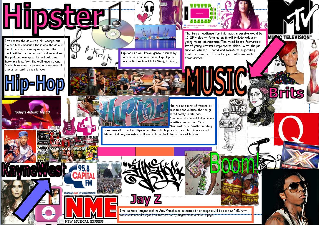
Monday, 3 October 2011
Questionnaire :
1. Are You Male or Female?
2. How old are you?
3.How often do you buy a magazine?
4. what main reasons make you buy a magazine for ?
5.Many magazines have a bold colour scheme would this make you want to buy it?
6.Would you prefer a music magazine to have more stories , fashion , interviews ,events or reviews ?
7.What do you like most about HipHop?
8.How much do you think is reasonable to pay for a music Hip Hop magazine?
9.what colours would you like to see in a HipHop magazine?
-Red and Blue
-Blue and Green
-orange and purple
10.what offers would you most like the most in a magazine - Discount in music shop or free CD?
11.How would you improve a music magazine?
12. Do you know any hip hop artists? If yes who do you like?
Rationale
The title of my Hip-hop magazine is called Hipster. Hipster will be a magazine aimed at the 15-25year olds in the grade category C1-D. It will be of reasonable price so it’s easily affordable. The three main colours I’ve chosen to use will be blue , purple and orange as they are simple and bright colours to make my magazine stand out. The colours are all suitable for male and female. Most magazines choose 3 colours maximum so it doesn’t get confusing. The highlighting devices will be star shaped as in most magazines highlighting devices are shown as circles, banners or stars. The highlighting device will feature the price and an offer or discount to appeal to the audience. Hipster will have a catchy slogan so readers of my magazine will recognise it when hearing the phrase. I will use simple bold fonts as simple fonts on a magazine are easier to read .The magazine will feature fashion, lifestyle and music from the culture Hip-Hop. The dennotation of my magazine will be celebrities, HipHop lifestyle, interviews and gossip.
Insperational Texts
As a member of the audience each of these five magazines attracts me to want to buy it. All containing a well known celebrities story helps appeal to the audience.
The first one which is a magazine called LOOK really stands out. I like that the main colours is only pink and white. I also like that the Masthead is Bold. When doing my magazine I would like to incorporate the big bold one worded masthead as most magazines are titled with one word. I would also like to incorporate the element of using only 2-3 colours so it wont confuse the audience. When looking at the magazine LOOK it sends the message that when you read this magazine you’ll find out the truth about Cheryl’s life and because of Cheryl’s well known status people will want to read it. I like that Look has a main sell line which is bold and sort of jumps out where as the others are in a smaller font and use the image alone to stand out .
With the second magazine More! I also like how only 2 main colours have been used. I like the black on yellow affect and this could be something else I use in my magazine because it stands out. I also like the super smiler pose used. I also like the fashion on the front which on both magazines LOOK and More! Have a line such as No Regret Buys and high street drops. Suggesting that there cheaper also appeals to the audience. In the Vogue magazine the first thing that inspires me is the Cheryl’s pure style because she’s always seen wearing nice clothes. The colour palette also stands out with the white on pink. I would like to use the style of writing of VOGUE in my magazine because its simple. I would also like to use a big main image because on every magazine you see the main image drawing people in. I think the framing in this picture is good as it hasn’t cut off any parts of Cheryl’s body unlike the LOOK and More magazine have.
The fourth magazine Grazia has the image over the title but because it’s a well known magazine it doesn’t matter. Once again I like the use of 3 colours orange, white and blue. In my magazine I would like to use sub images in the way this magazine has where they look on an angle. The number 50 stands out because its bigger than the rest of the other words. On each of the four magazines all have a small barcode normally in the corners which I thinks a good idea because it leaves more room for the more important news. Glamour magazine inspires me because of the happy super smiler pose Beyonce gives out. Its giving the message to the audience that she’s a happy, confident woman and this appeals to the women who aren’t as confident. Once again I will use the idea of 3 colours because all five have used the maximum of three. In my magazine I would also like to incorporate the using circles or shapes idea. I like how the things that are most important are either in the colour pink or orange so it’s more visual for people to see. I like how above the masthead there’s a slogan “ Britain’s number one woman’s magazine” I would like to include a type of slogan in my magazine. The other glamour magazine sends the message about fashion that everyone can wear. The main image hasn’t been cut off and once again the circle shapes repeat. I also like the Bold colour competition. Magazines put competitions on the front to entice the public to take a chance and enter. By research and looking at these magazine covers I can take ideas from each and more magazines to make mine the best aesthetically pleasing. Each of the magazines are different in their own way but all include the conventions to try and sell the most copies. Because each magazine is so competitive the one with the best story is likely to appeal the most which is what I need to remember when creating my magazine. I like that 5 of them contain slogans which is another idea that i could use when making my magazine. The slogan will be easy to remember and catchy to go with the magazine.
Preliminary Task
I love the layout of the contents page because its simple to follow and easy to read. When making my Music magazine I will take in to consideration the layout of the contents page. I like this front cover but I think in order to make it better I will have more fitted on and a bigger picture. what I liked about my creative decisions was the colour scheme and the highlighting devices used. However I didn't really like that there wasnt many stories on the front cover or contents page.
Subscribe to:
Posts (Atom)